Combine Next.js + material-ui + styled-components with TypeScript
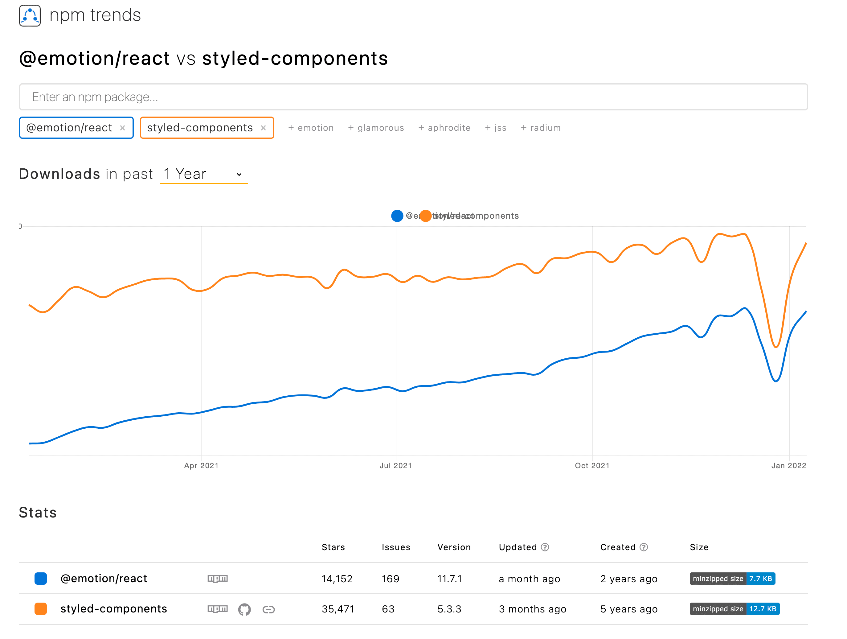
When using material-ui (now renamed to mui) library for React, you have to choose one css-in-js engine. material-ui recommends [@emotion/react](https:// github.com/emotion-js/emotion) for the first class, and interfaces of both css-in-js are almost the same, but in fact, styled-components is still more popular than emotion.

However, the combination of material-ui + styled-components + TypeScript is not easy to set up, and it becomes even more difficult when you want to include your own style definitions in the material-ui theme. Today I want to share with you how to set this up.
The method from material-ui's documentation
Set up the styled-engine in package.json
{
"dependencies": {
"@mui/styled-engine": "npm:@mui/styled-engine-sc@latest"
},
"resolutions": {
"@mui/styled-engine": "npm:@mui/styled-engine-sc@latest"
},
}
Add configuration to paths in tsconfig.json
You need this setting to enable the correct types of css in import { css } from "@mui/material/styles";.
{
"compilerOptions": {
"paths": {
"@mui/styled-engine": ["./node_modules/@mui/styled-engine-sc"]
}
},
}
Next.js webpack settings
const withTM = require('next-transpile-modules')([
'@mui/material',
'@mui/system',
]);
module.exports = withTM({
webpack: (config) => {
config.resolve.alias = {
...config.resolve.alias,
'@mui/styled-engine': '@mui/styled-engine-sc',
};
return config;
}
});
Adding custom variable types to theme
Since this is a global type definition, it is better to define it in global.d.ts. You can add the following to global.d.ts in the root folder and TypeScript will merge them into the material-ui default theme type:
declare module "@mui/material/styles" {
interface Theme {
status: {
info: string;
danger: string;
};
}
// allow configuration using `createTheme`
interface ThemeOptions {
status?: {
info?: string;
danger?: string;
};
}
}
Create the theme.ts file and pass it to the ThemeProvider
import { createTheme } from "@mui/material";
export const theme = createTheme({
status: {
info: "#2196f3",
danger: "#ff0000",
},
});
import type { AppProps } from "next/app";
import { ThemeProvider } from "styled-components";
import { theme } from "../theme";
function MyApp({ Component, pageProps }: AppProps) {
return (
<ThemeProvider theme={theme}>
<Component {...pageProps} />
</ThemeProvider>
);
}
export default MyApp;
Try it out
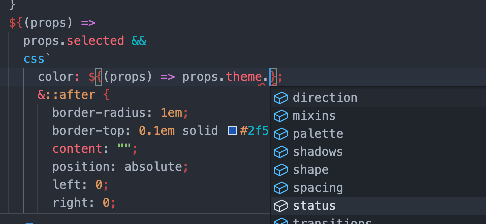
Intellisense is now working.

But it's not perfect
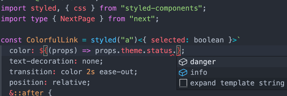
If you try to use the css helper function of styled-components:

Yes. The type of theme is not recognized in css.
The paths setting in tsconfig.json just changes the css helper function from a reference to @emotion to a reference to styled-components, so the types defined in material-ui are not reflected in the css of styled-components.
Solve this problem
Define the following types in global.d.ts:
import { Theme as MuiTheme } from '@mui/material/styles';
declare module "@mui/material/styles" {
interface Theme {
status: {
info: string;
danger: string;
};
}
// allow configuration using `createTheme`
interface ThemeOptions {
status?: {
info?: string;
danger?: string;
};
}
}
// enable types in `css` helper function in `@mui/material/styles`
declare module "styled-components" {
interface DefaultTheme extends MuiTheme {}
}
Great! Now you can use the css helper function in @mui/material/styles with type checking.

A better solution
As material-ui is using the context of styled-components, we're able to use original styled function in styled-components instead of that in @mui/material/styles. Then, the better solution is as follows:
Set up the styled-engine in package.json
{
"dependencies": {
"@mui/styled-engine": "npm:@mui/styled-engine-sc@latest"
},
"resolutions": {
"@mui/styled-engine": "npm:@mui/styled-engine-sc@latest"
},
}
Set webpack in Next.js
/** @type {import('next').NextConfig} */
module.exports = {
reactStrictMode: true,
experimental: {
styledComponents: true,
},
};
Adding custom variables' types to the theme
Since this is a global type definition, it is better to define it in global.d.ts. You can add the following to global.d.ts in the root folder and TypeScript will merge them into the material-ui default theme type:
declare module "@mui/material/styles" {
interface Theme {
status: {
info: string;
danger: string;
};
}
// allow configuration using `createTheme`
interface ThemeOptions {
status?: {
info?: string;
danger?: string;
};
}
}
// enable types in `css` helper function in `@mui/material/styles`
declare module "styled-components" {
interface DefaultTheme extends MuiTheme {}
}
Create the theme.ts file and pass it to the ThemeProvider
import { createTheme } from "@mui/material";
export const theme = createTheme({
status: {
info: "#2196f3",
danger: "#ff0000",
},
});
import type { AppProps } from "next/app";
import { ThemeProvider } from "styled-components";
import { theme } from "../theme";
function MyApp({ Component, pageProps }: AppProps) {
return (
<ThemeProvider theme={theme}>
<Component {...pageProps} />
</ThemeProvider>
);
}
export default MyApp;
Try it again
import styled, { css } from "styled-components";
styledの中:

cssの中も:

Finish
It feels good to be able to use type-safe themes. However, material-ui@v5 doesn't support styled-components very well, so when you'd better consider carefully when choosing the css-in-jss engine for material-ui, or think again, 'Do I really need/want to use material-ui?'. It may have another better choice.
Full project is here:
https://github.com/thundermiracle/nextjs-mui-styled-components-with-typescript

Blog part of ThunderMiracle.com
Comments load when in view